What HubBox Checkout Filter Research Reveals About Pickup Behaviour

When we asked shoppers what mattered most in choosing a pickup location at checkout, we expected distance to win. It didn't. Opening hours came first across every demographic we tested.
It’s one of several findings from our latest UXR Lab study, and it has implications for how retailers design their pickup at checkout options, as well as how carriers think about network utilisation. Small decisions, like where a filter sits or what it says, turn out to be more important than most people assume.
At a glance (TL;DR)
- Shoppers prioritise opening hours over distance when choosing a pickup location
- Filter placement affects confidence before a filter is even used
- Filter placement affects confidence before a filter is even used
- Clear “no-results” messages keep shoppers moving through checkout
- Faded pins prompt exploration without creating confusion
- 100% of participants rated the new filter design 4 or 5 out of 5
How we do our analysis
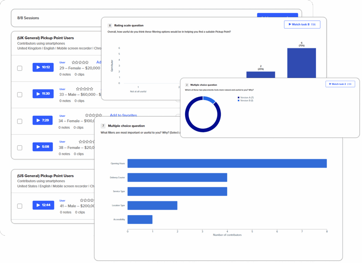
The HubBox UXR Lab tests the details most checkout designs take for granted. This study put a redesigned set of filter views in front of pickup-point users across the UK and US, measuring how shoppers engaged with new layouts, filter logic and empty states against current designs. Through ongoing research combining A/B testing, Likert scale analysis and qualitative feedback, we measure what influences shopper behaviour.
Why filters are important to the pickup experience
Filters are the part of the pickup experience that shoppers interact with most actively. When done well, they take someone from “I need to find somewhere to collect this” to “I’ve chosen.” When they don’t, they create friction that leads to cart abandonment. That friction also affects carriers too, with every abandoned checkout at pickup that defaults back to home delivery.
Our earlier research covered visibility and clarity in the pickup journey, but this study goes deeper and looks into the mechanics of filtering itself. How do shoppers engage with filters? What do they expect? And which elements can change their behaviour?
We tested pickup-point users across the UK and US, spanning a range of age groups, devices and shopping behaviours. Analysis combined Likert scale scoring with A/B testing and qualitative feedback, so we could understand what users chose and why.
What drives pickup at checkout?
Some of what we found confirmed good UX instinct. Some of it didn’t.
Opening hours (not distance) is the priority filter
Every participant selected opening hours as their most important filter. Courier and service type followed, each chosen by around half of respondents. Despite being the default assumption in most checkout designs, distance didn't lead.
It shows shoppers care less about what’s nearby and more about what’s convenient. A pickup point 200 metres away that closes at 5pm isn’t helpful to someone who finishes work at six. Design that reflects pain points serves shoppers better than design that leads with a map radius. Lead with opening hours and the experience immediately feels more helpful.
Filter placement shapes the experience before it’s even used
Eighty-eight percent of participants preferred the filter button next to the search input, with clear resistance to a separated layout. They described it as the most natural layout, saying search and filter felt like one action as opposed to two.
Making sure there’s coherence at checkout helps build confidence, and shoppers trust an interface when it feels logical. But they hesitate when it feels assembled.
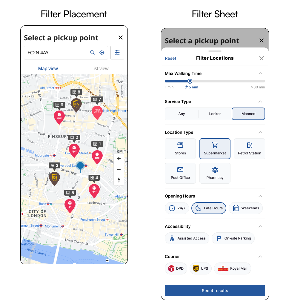
Distance toggles earn their place, especially for unfamiliar areas
Half of participants found distance filters particularly helpful when shopping outside their usual area. A 15-minute radius came up consistently as the sweet spot. It was practical without limiting results.
That’s particularly relevant for carriers trying to increase pickup usage. Shoppers in unfamiliar areas are more likely to fall back to home delivery if finding a convenient collection point feels difficult or time-consuming.
Empty states don't have to mean abandoned checkouts
Every participant said they would adjust their filters if they came across a no-results screen rather than leave. That's a better outcome than most retailers probably assume, but it depends entirely on the empty state being well designed. A clear message and an obvious way to broaden the search keeps shoppers in the flow. But a dead end doesn't.
Faded pins encourage exploration rather than confusion
All participants understood intuitively that faded map pins point to locations outside their current filters but are still selectable. Rather than creating uncertainty, it prompted exploration, with shoppers broadening their search without being told to.
It’s a small detail, but it adds up across thousands of checkout sessions.
Satisfaction with the new design was high across the board
One hundred percent of participants rated the redesigned HubBox filter view four or five out of five. "Exactly what I want," and "more thoughtful than expected" were the words they used, a sign that when pickup UX is built around real shopper behaviour, the difference is immediate and obvious.
How checkout UX affects carrier networks
Most of our research is framed around retailer checkout conversion, but the network implications are just as significant. Shoppers who can find a convenient pickup point with ease are more likely to use it, and more likely to collect promptly. That means less dwell time and more reliable network utilisation, with fewer packages falling back to home redelivery.
Yes, checkout UX is a retailer problem. But it’s also a carrier last-mile issue.
The one thing to act on first
If you take one thing from this research, audit your opening hours filter. Not just whether it exists, but how visible and helpful it is, and whether shoppers reach for it first.
That’s where retailers and shoppers are furthest out of sync. And it’s the easiest place to fix.HubBox's Customer Success team works directly with retailers and carriers to implement findings from the UXR Lab. To see how it works in practice, book a demo.